February 11, 2020
VPL HQ
by Candice Marzetz | Posted in:
ENVIRONMENT + BRANDINGIt was a pleasure to work in tandem with the Vantage Point Logistics (VPL) Leadership Team, Dupler Office, and Mode Architects to help define and articulate VPL’s brand, culture, look and feel in this spacious office environment for their growing team.

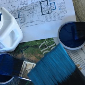


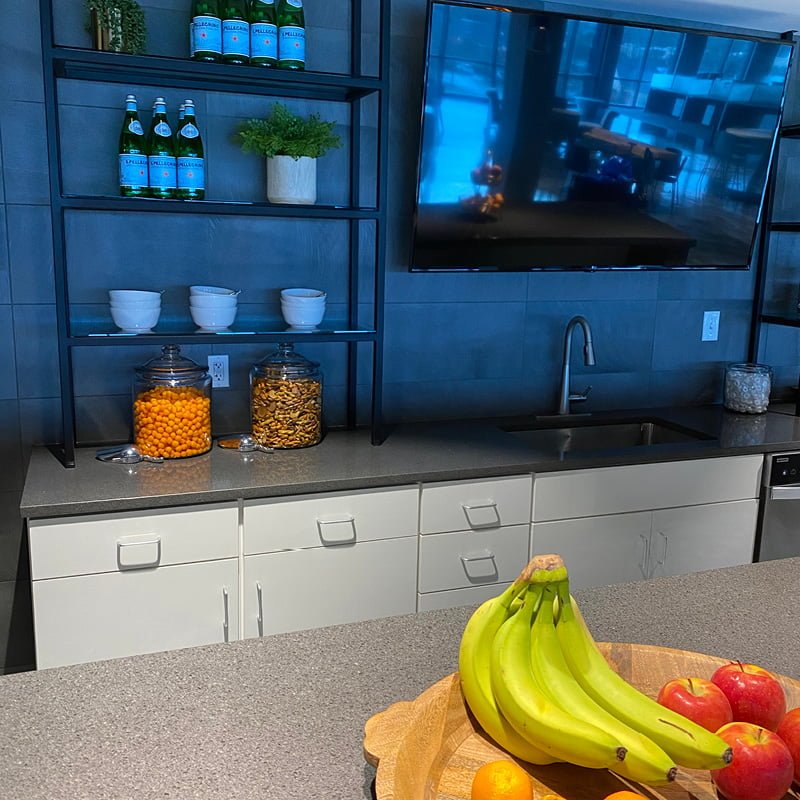
Read the metropreneur article here:
https://themetropreneur.com/columbus/at-work-vpls-new-hq-ae1/?fbclid=IwAR0txHXwgUb5Ql4ZjhWSEruU8I0JXKko_W0cUKg9tXVEmX5Mygz3FEjIpBE
September 13, 2019
A Better Start…for Life
by Candice Marzetz | Posted in:
BRAND STRATEGY + DESIGN
Nature’s One, the leader in organic nutrition for infants and toddlers, asked us to help refresh their brand and make it more pertinent to their target audience of parents who can’t or choose not to breastfeed. Their existing brand was positioned as the “first organic formula,” but didn’t go further to inspire parents to choose the brand because it would be the best for their baby.
We created a tagline that positioned Nature’s One not just as a great formula for infancy, but as “A better start…for life.” By showing that Nature’s One formulas contained everything needed for optimal health, growth and brain development, we made it clear that by starting with us, a child will be further ahead down the road.
GOALS/OBJECTIVES
Our goal was to position Nature’s One as a trusted friend and expert, who cares as much about baby’s health and well-being as her parents. We wanted parents to know that Nature’s One had expertise, authenticity, and a welcoming community where they could ask questions, get answers, and trust that their baby was in good hands.
WHAT WE DID
We refreshed the logo, fonts and color palette to be fresher and more appealing, and developed a story and visual campaign to guide the brand imagery, collateral and website development that showed kids doing amazing things…things that they could only do because they had had such a great nutritional start.
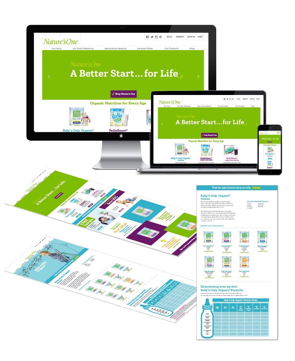


Candice & Co. and Verb Garden, Inc. | Brand Strategy & Development
April 9, 2018
Creating and Styling an Extraordinary Garden Tablescape
by Candice Marzetz | Posted in:
ENVIRONMENT + STYLING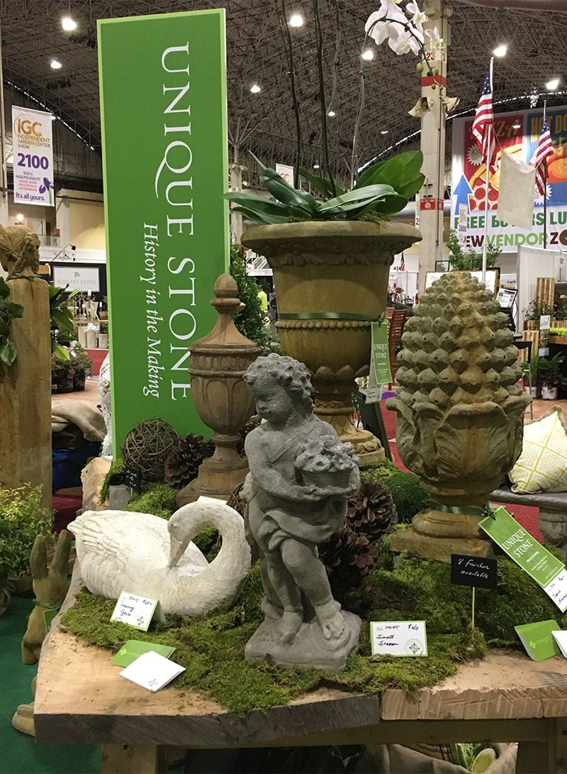
We turned an ordinary trade show display into an extraordinary and authentic garden space most recently at the (IGC) Independent Garden Center Show in Chicago at the Navy Pier. For this project, we started by designing and styling a grand tablescape for the main focal point of the booth, always with the end-result in mind to highlight our client’s unique collection of antique reproductions and garden decor.
Not only was it was important that we create an approachable, yet sophisticated look and feel for our client, but we needed to provide an easy to dismantle and replicate booth display design that could be transported from one trade show to the next. To accomplish, we started with designing, sourcing, and crafting in Columbus, Ohio with our favorite carpenter and builder Robert Orr. Together, with Robert’s expertise, we paired two beautiful live-edge American white oak slabs for the table surface with a set of ever so sturdy, rough-cut sawhorse legs (so very sturdy, because they’d need to hold the several hundred of pounds of the cast stone treasures upon).
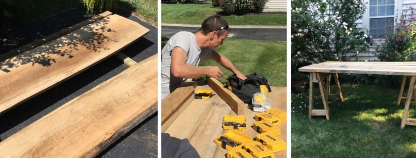

With the supplies and table packed we were off to Chi-Town in our Chevy Tahoe rental nicknamed “Beast” (the perfect transport—roomy, smooth ride with commanding road presence). Once in Chicago, we quickly went to work setting up and styling the dozens of cast stone treasures, urns, water features, jardiniers, animals and statues, florals, orchids, textural elements, layers of lush, green moss, wood slabs and North Carolina pine cones to anchor and complement the garden tablescape abundantly.
Around the perimeter of the tablescape, we created seven tableaux areas to display and highlight the magnificent urns (styled with overflowing with lush pink hydrangeas), statues (adorned with boxwood wreaths and Southern magnolia swags), water features (styled with garden pebbles), a garden bench (inviting everyone to take a moments rest) and a console (ready to entertaining and viewing the latest Unique Stone catalog).

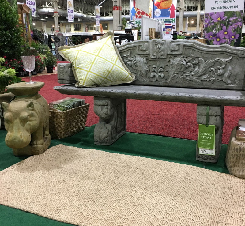
Among the tableaux we created a sitting area with the Italian Garden Bench. We found this David Hicks inspired chartreuse pillow and a woven jute patterned rug to pair with Unique Stone’s favorite whimsical garden stool the Majestic Hippo. We just adore this little guy—he’s the perfect table for your summer cocktail.
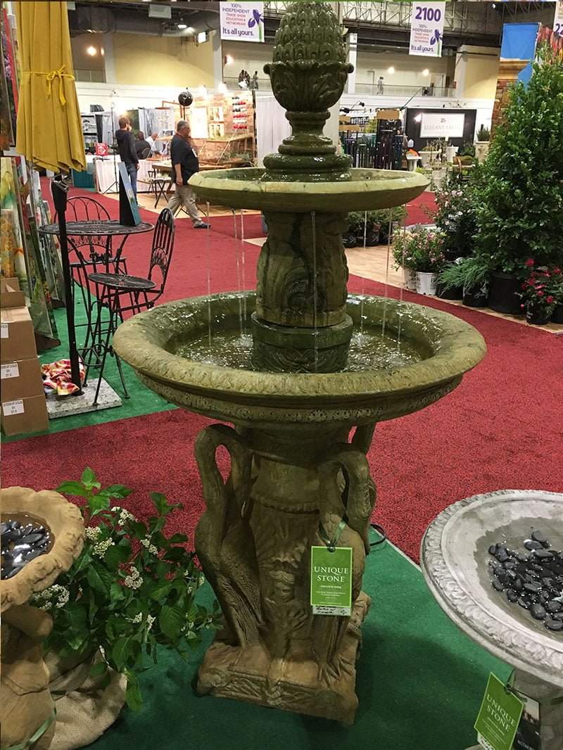
Far left of the hippo, the water features are anchored by the Heron Fountain and two birdbaths filled with garden pebbles. The trickling water in the fountain within the space added a tranquil moment for all to enjoy during the show.
 The Atlas Console was the perfect space to display catalogs and refreshments to those who stop by to explore the garden display.
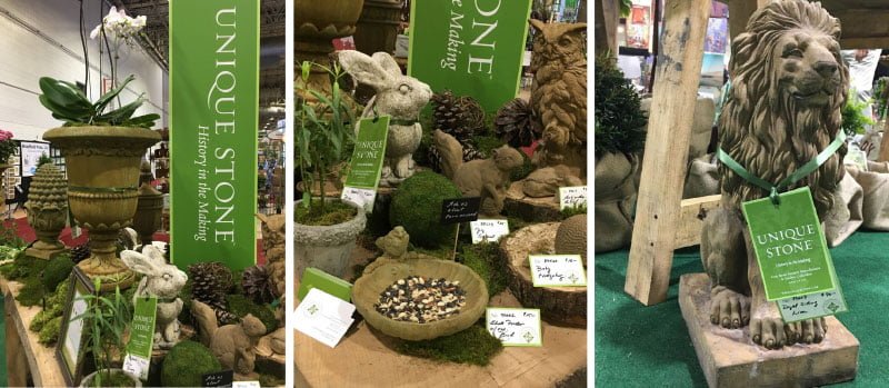
Marketing elements were also an essential layer to create brand recognition. A tall perpendicular sign, vertically designed with the Unique Stone logo and tagline “History in the Making” was centrally placed among the tablescape allowing visibility from all directions of foot traffic during the show. In addition, handwritten chalk signage and cards shared tips, pricing and FAQ’s Unique Stone is often asked. Hang tags were adored on larger cast stone product throughout the booth, tied with dark green ribbon to tell the brand story and clearly share the item number, product name and price to all who shopped the IGC show.
We hope you enjoyed reading about our latest project for Unique Stone.
May 16, 2017
Eat, Play and Style—Our Ritual of Getting to Know Your Brand
by Candice Marzetz | Posted in:
DESIGN + FOOD
We thrive on collaboration, high energy and playing with our clients’ products. We taste it. We smell it. We let it sit on our desk. We take it for a ride in the car. We take it on a walk. Toss it in our travel bag. Pop it in our mouths. Sprinkle it. Stack it on a shelf. We literally eat, play, style, and play some more. We perform this ritual until we reveal a products unique story.
In the case of The Toasted Oat, upon first glance you simply see a soft creamy outer package. Upon ripping open the bag you quickly discover the contents are quite different than any other granola you’ve ever experienced in your life. It’s soft and it’s chewy more like a crumbled cookie, full of delicious whole-ingredients, no preservatives, and gluten-free, a far cry from any other granola on the market.
Strategic story-teller Christine Myers, of Verb Garden, quickly landed upon the unique selling proposition and tag line for this unique granola. Creating the message, “We took the ‘crunchy’ out of granola.” And from there we were ready off designing, developing, and styling the brand look and feel; partnering with Demo38 on website development and Jones Photography to bring every aspect of The Toasted Oat granola website to life.
We had a great time working with Erika, and ate all the amazing, soft-and-chewy, home-baked granola our bellies could hold. Check out her website and DEFINITELY check out her Toasted Oat Bakehouse Granola—it’s delicious!
Save
Save
Save
Save
January 13, 2017
Something UNIQUE has arrived!
by Candice Marzetz | Posted in:
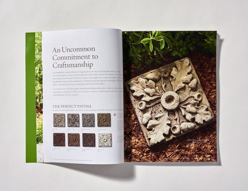
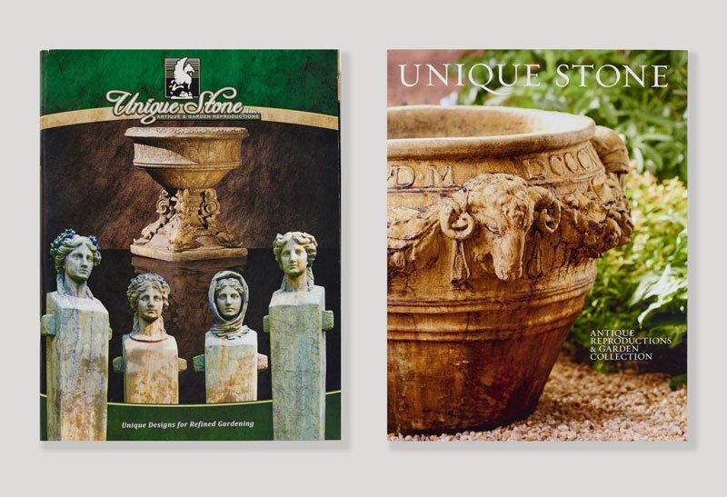
BRAND STRATEGY + DESIGNWe’re delighted to share how we helped a company that “remakes history,” make a little history of their own. A family business with its roots in Rockingham, North Carolina, Unique Stone allowed us the opportunity to help them establish their new brand identity; shared this week at the America’sMart in Atlanta. We can’t wait to hear how the catalog was received at the show.
Take a look and let us know what you think: https://uniquestone.com
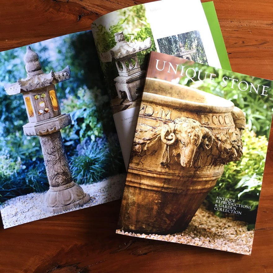


Before and After:
Brand Strategy & Development, Logo Design, Creative Direction, Storytelling & Copywriting,
Advertising and Catalog Design | VERB GARDEN and CANDICE & CO.
Photographer | MITCH WIEBELL
Photography Direction & Styling | CANDICE & CO.


 The Atlas Console was the perfect space to display catalogs and refreshments to those who stop by to explore the garden display.


 Every day at Candice & Co. is a chance to dream and create. We seek out inspiration from everywhere, and consider ourselves fortunate to work with some of the world's finest artisans, craftsmen, photographers,
tastemakers, design gurus, writers, and innovators. When we find something (or meet someone) that especially captivates us, we can't wait to share it. And that's exactly why we created this blog. Check it out to see what's happening in our world and in the big, wide, creative world at large. Maybe it will inspire you, too!

